
Designing a faster, more effortless checkout experience
A checkout redesign that improved completion rates and customer sentiment.
2023
Strategy
UX Research
Product Design
CVR

3.5%
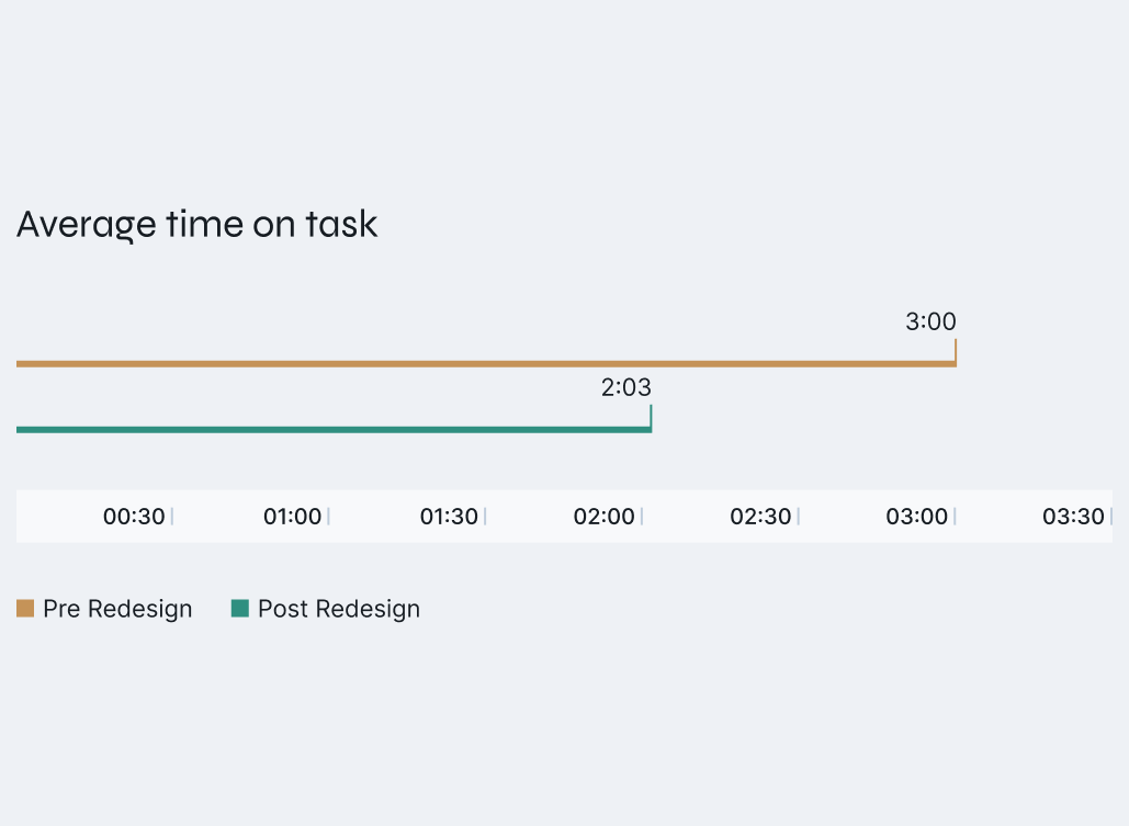
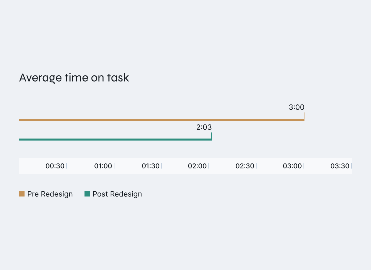
Average time on task

02:03 (1 min less)
Revenue
$16 million
Overview
The challenge
Guitar Center is a long-established brand with deep roots in brick-and-mortar retail. But digital growth lagged behind the industry until the pandemic accelerated online sales.
This shift created urgency to modernize the e-commerce experience — starting with checkout, where user friction and drop-offs most directly impacted revenue.
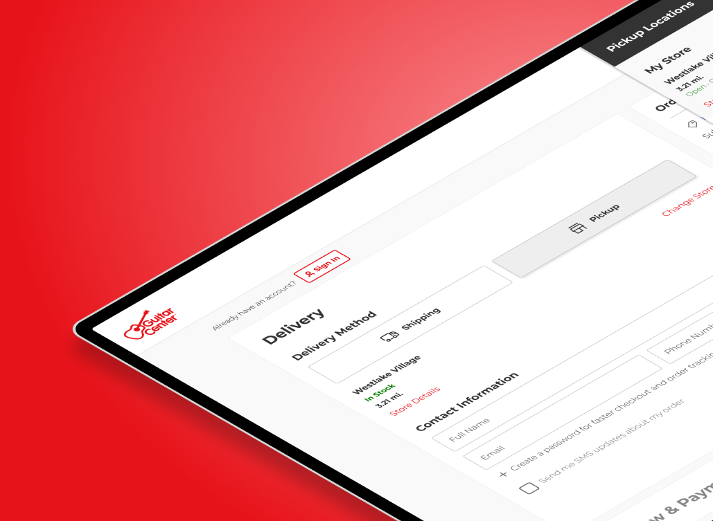
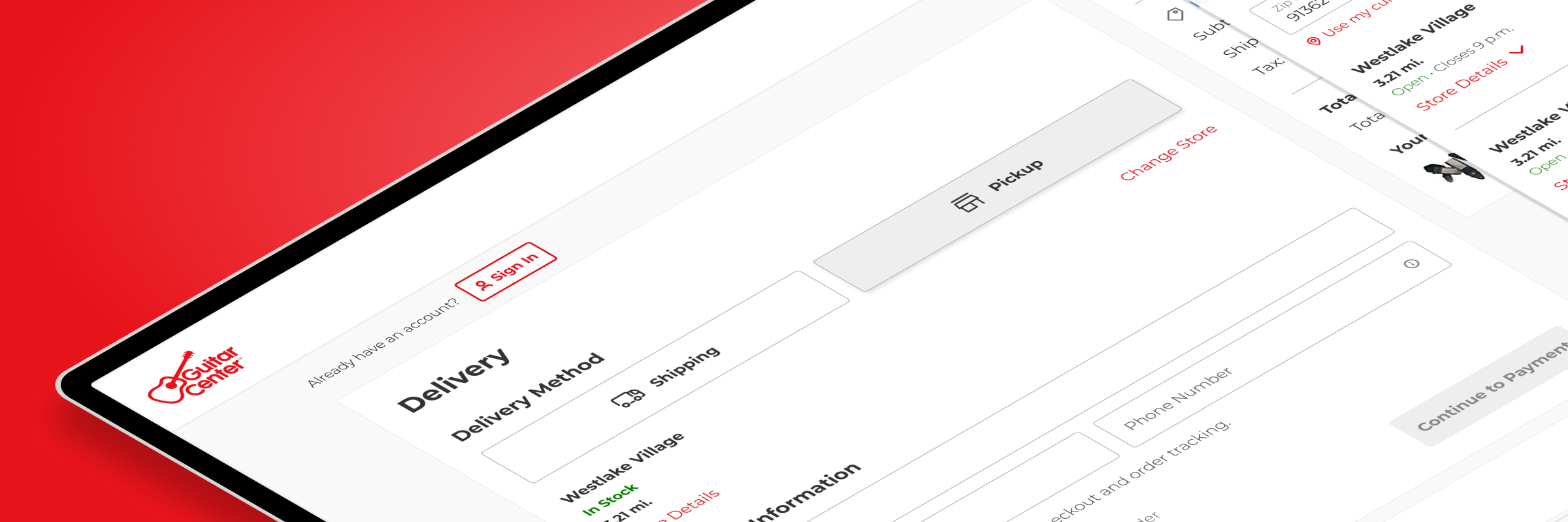
This was the previous version of the checkout.
Problem definition
Analytics showed the biggest drop-off happened between cart and checkout.
Customers often entered checkout just to see the final price — then left when taxes or fees appeared.
From a UX view, the process was long and cluttered. Even when users advanced, excess information slowed them down or caused abandonment.


Enhance Usability
shorten the process and simplify forms.


Increase Conversion Rate
reduce friction and encourage completion.


Optimize for Mobile
ensure a fast, intuitive experience on all devices.
We defined these objectives with our product and business partners.
My role
As Senior UX Designer I led UX strategy and design for Guitar Center’s checkout redesign across web and mobile.
Worked with analytics and product teams to diagnose drop-offs between cart and checkout.
Observed users, benchmarked competitors, and simplified the flow with our updated design system.
Time frame
4 months
Platforms
Web, mobile, native app
Research Methods
Competitive & usability studies, industry benchmarks
Research & Discovery
Industry and competitive analysis
To ground the redesign in best practices, I reviewed checkout usability reports from Nielsen Norman Group and the Baymard Institute to identify current standards around conversion, form entry, and checkout efficiency.
Building on that foundation, I conducted a competitive analysis of leading retailers and Guitar Center’s direct competitors, scoring each experience against a defined set of usability and business criteria. This revealed where Guitar Center lagged, where our competitors excelled, and where opportunities existed to differentiate.
I found that Guitar Center’s biggest competitor fell short in most categories, but there were some valuable examples that helped build internal consensus around our approach.
While our primary competitor underperformed in several areas, those standout examples around transparency and checkout simplification informed the strategic direction of the redesign and strengthened alignment across teams.
Usability study (qualitative)
I began with an exploratory usability study to better understand how customers interacted with Guitar Center’s existing checkout. My goal was to observe pain points, patterns, and overall sentiment before redesign work began.
I conducted moderated sessions with regular Guitar Center customers, focusing on how they navigated each step of checkout, where they hesitated, and what caused confusion. This provided qualitative insight into user behavior.
Key observations revealed friction from redundant steps, unclear progress indicators, and information overload.
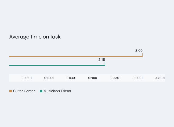
Comparative study (quantitative)
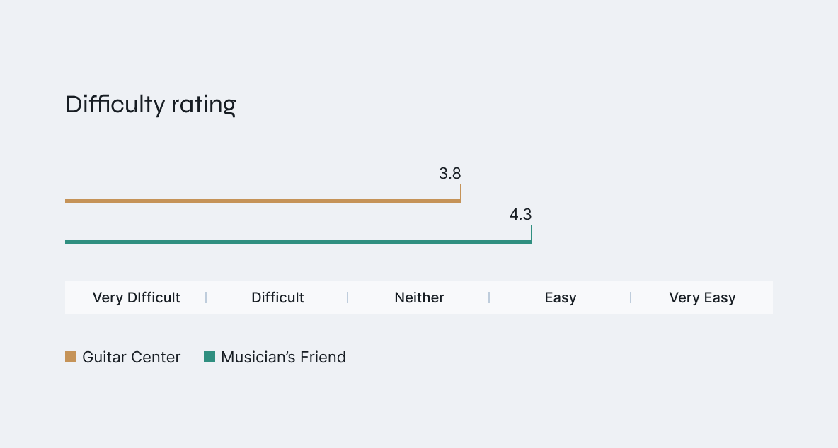
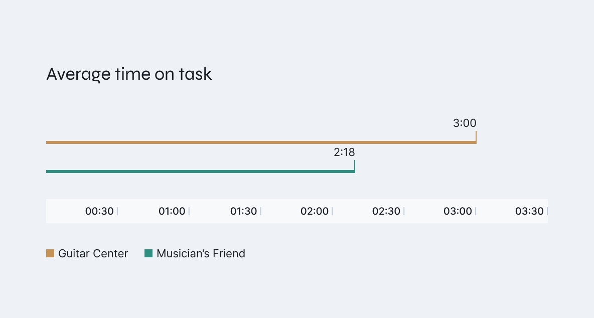
To validate findings and establish benchmarks, I conducted a comparative usability study with 40 participants for statistical significance. Participants completed checkout tasks on Guitar Center and Musician’s Friend, our sister brand that had implemented a single-page checkout a few years earlier.
The findings shaped the direction of the redesign, guiding early concepts centered on reducing steps, decluttering screens, and improving flow efficiency.
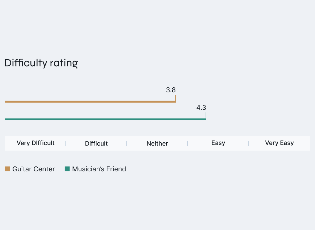
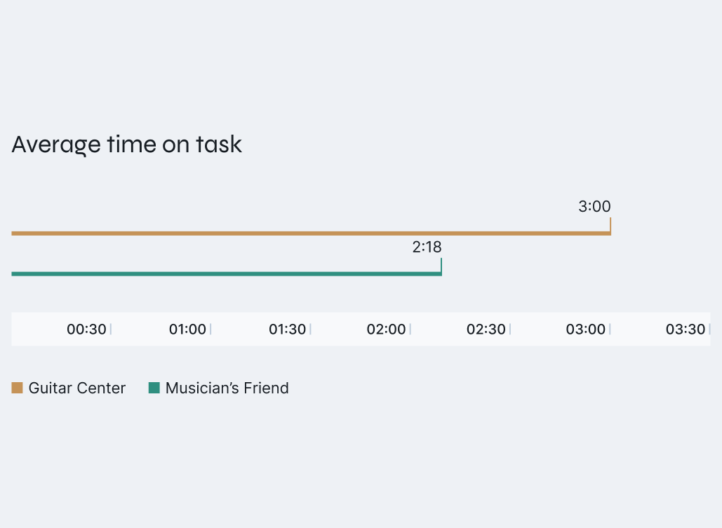
The results showed users completed tasks faster and with less effort on Musician’s Friend’s single-page checkout.
Design Strategy
Product requirements
Before starting design, I met with key stakeholders to clarify business goals and technical constraints. This alignment phase ensured we prioritized the right features early on and avoided costly changes later in the project.


Promote Sign Up
Include an “easy signup” option that uses customer information already gathered.


Improve Store Pickup
Streamline the store finder, simplify contact information entry, and enhance help labels.


Support Split Pay
Allow customers to combine payment methods seamlessly without manual calculations.


More Ways to pay
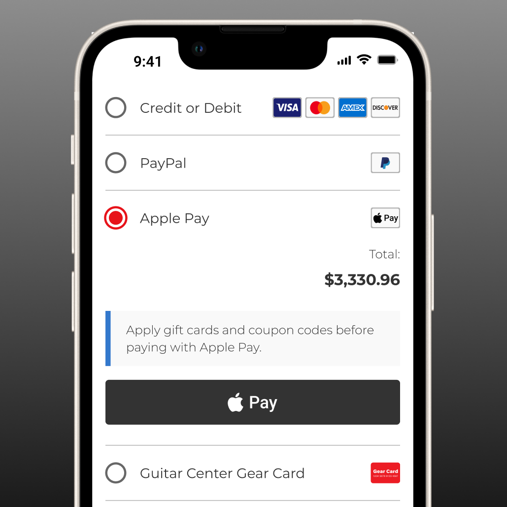
Integrate Apple Pay, PayPal, and pay-in-4 options such as Klarna and Afterpay.
These were the feature sets identified as critical to improving checkout performance.
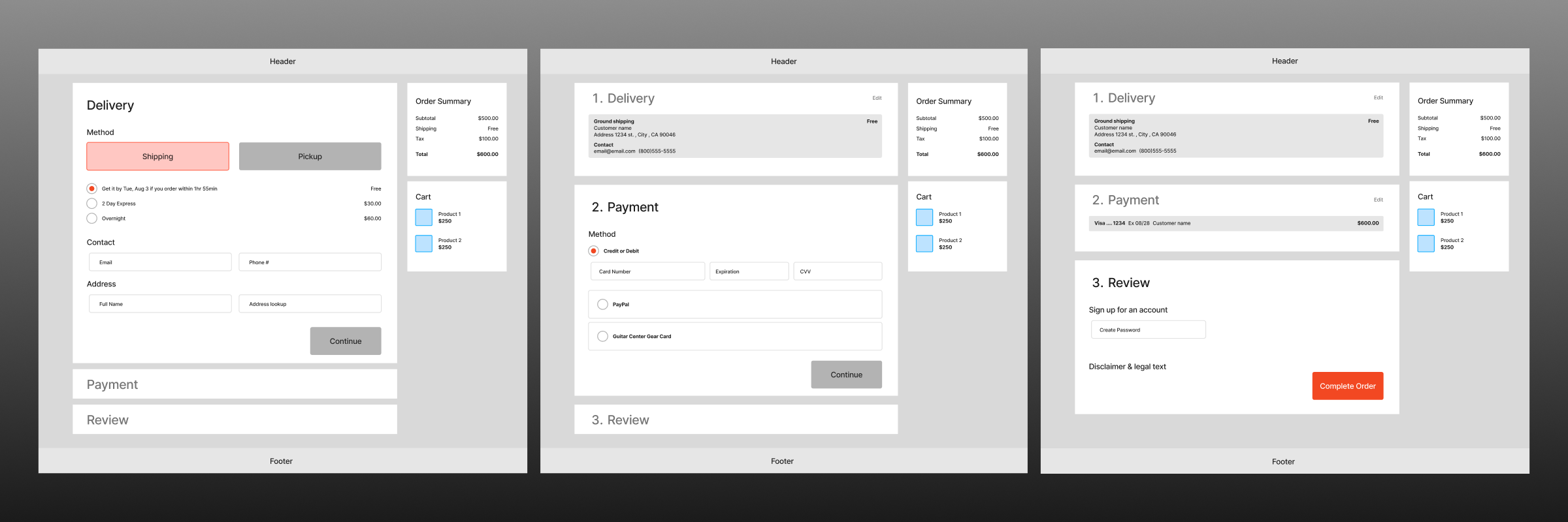
Initial Concepts
With industry trends, customer insights, and product requirements in hand, I created a low-fidelity version of the checkout flow. This approach allowed us to present the concepts to developers and stakeholders in a flexible, low-stakes manner, making it easier to accommodate any significant changes if needed. It also provided an opportunity to discuss the specifics of the product requirements in greater detail.
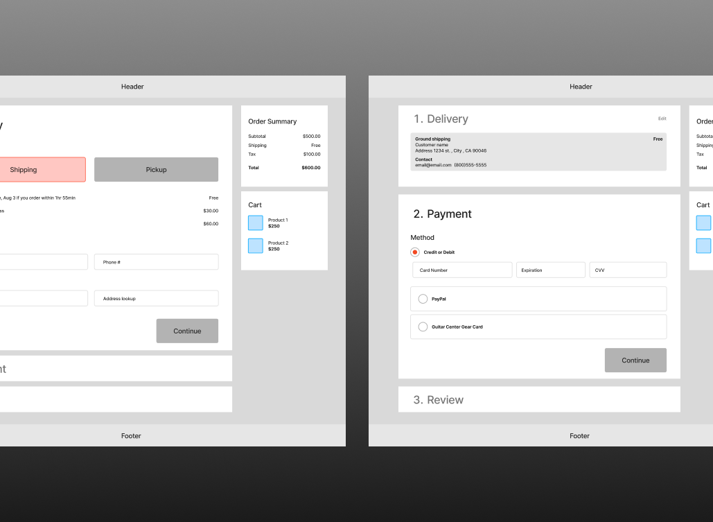
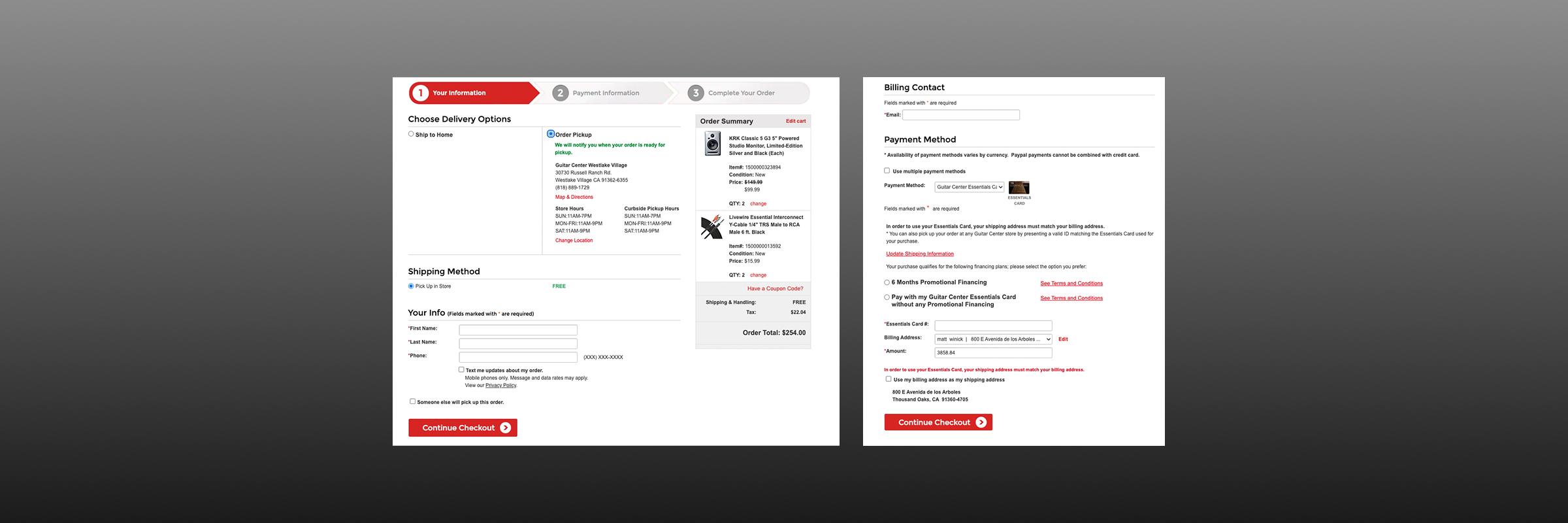
Here are several wireframes that represent the checkout flow and its various components.
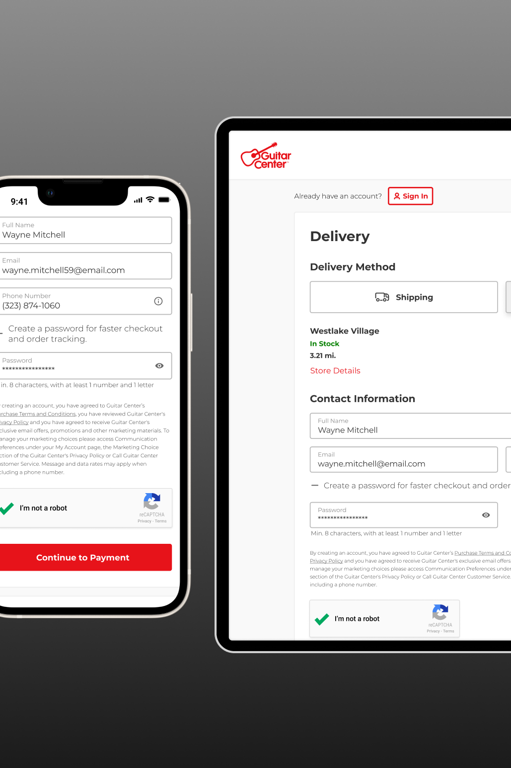
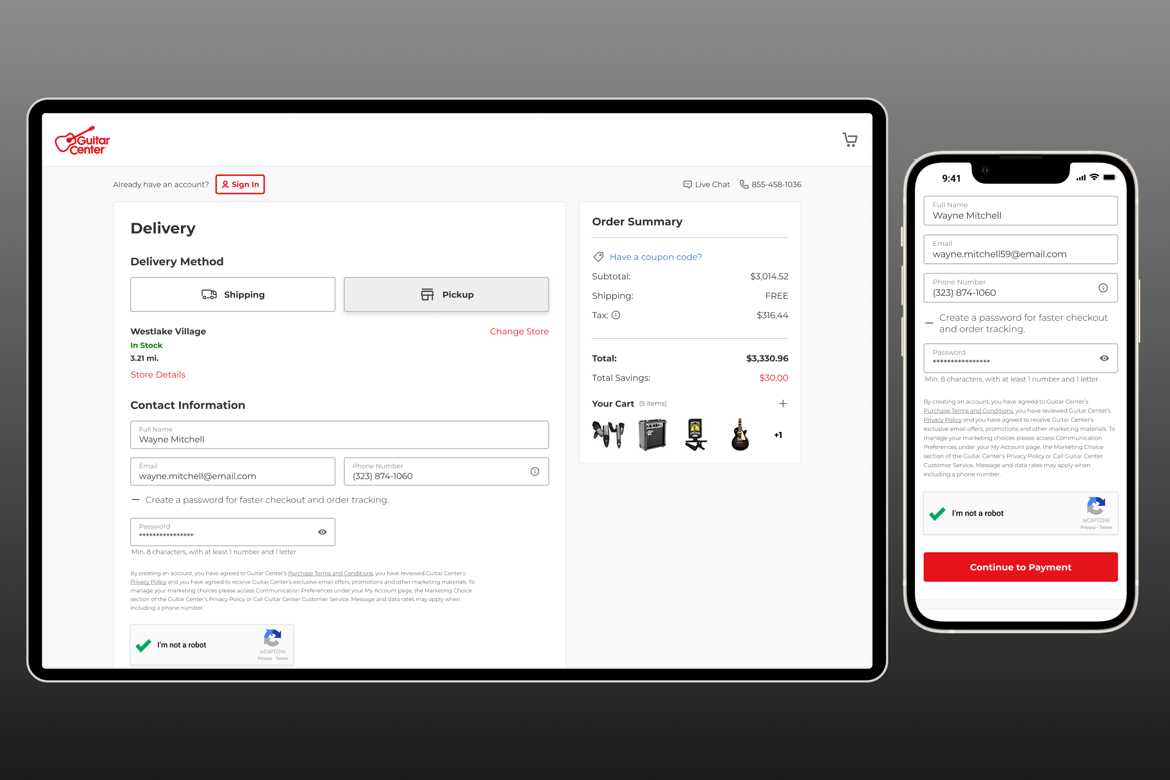
We implemented a streamlined sign-up that uses previously entered information, saving users time without disrupting their flow.
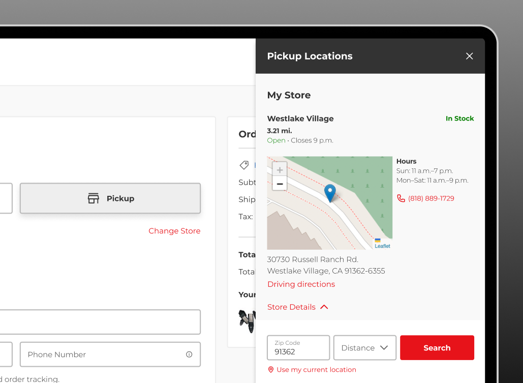
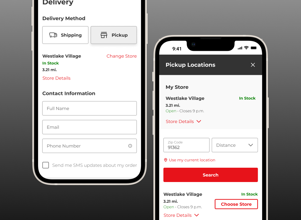
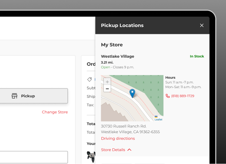
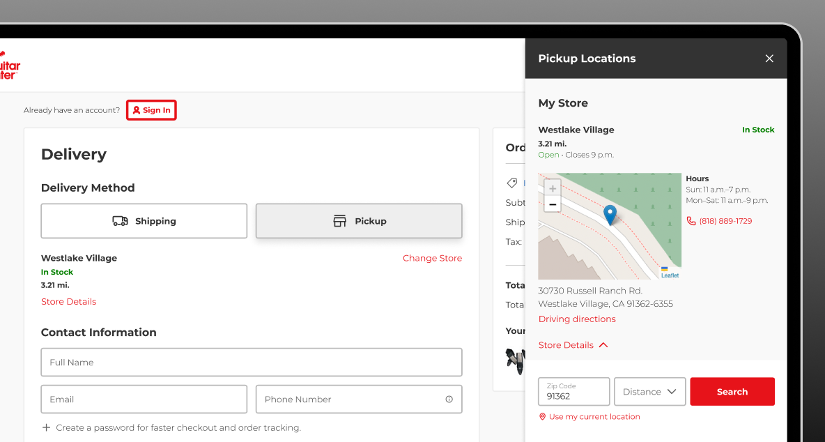
Here’s the refined version of the store picker and customer contact section. I streamlined the selection process and included key store details like driving directions.
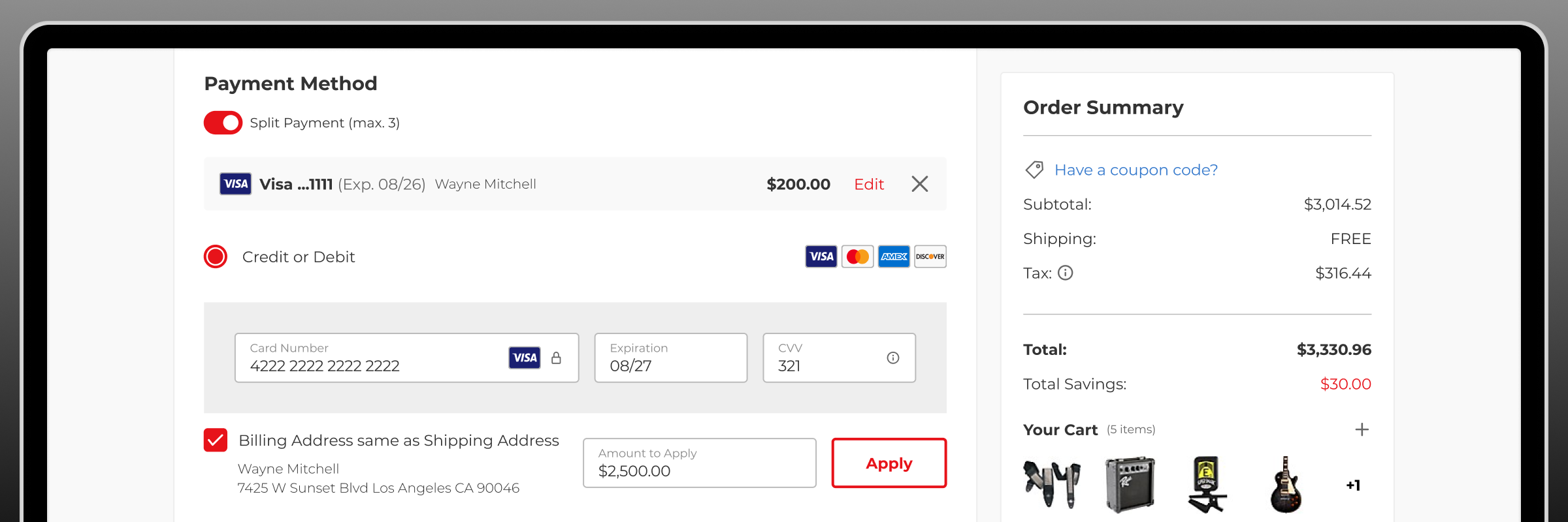
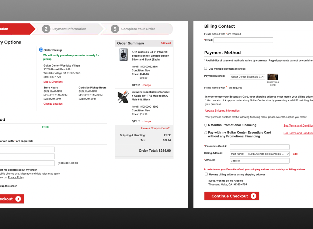
The split payment functionality significantly increased the complexity of the design and development effort, but it was crucial for meeting the business's needs.
Integrating third-party payment systems required reviewing documentation and ensuring the design aligned with each brand’s specific standards.
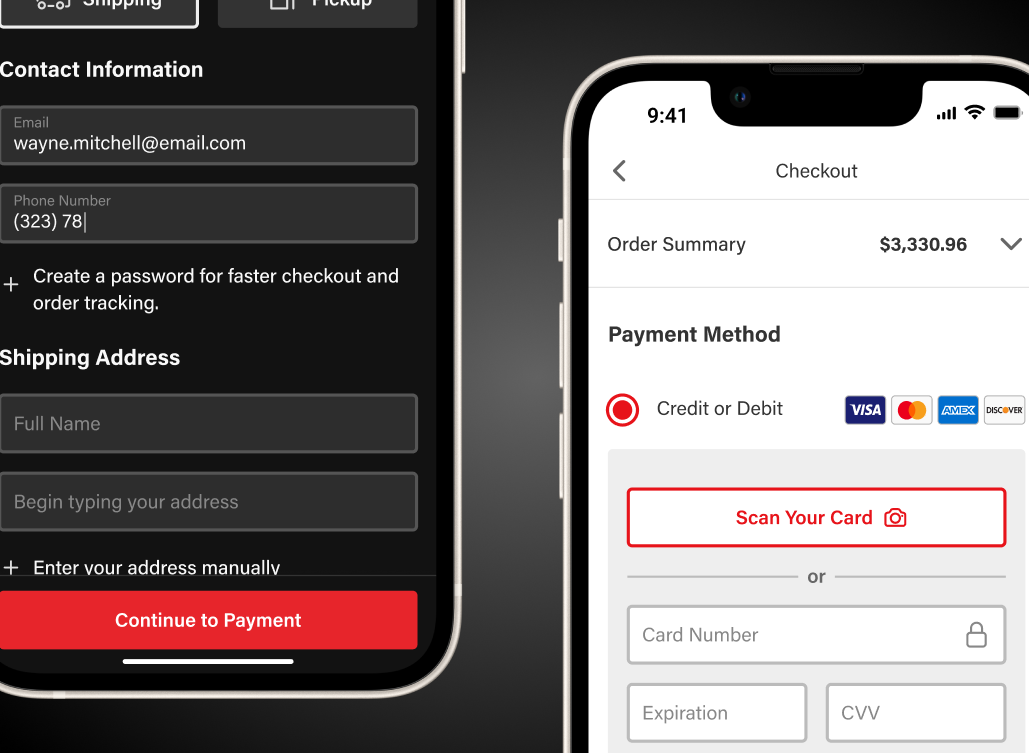
I designed a complete checkout flow for the native app, ensuring full compatibility with light and dark modes.
Outcomes
Validation
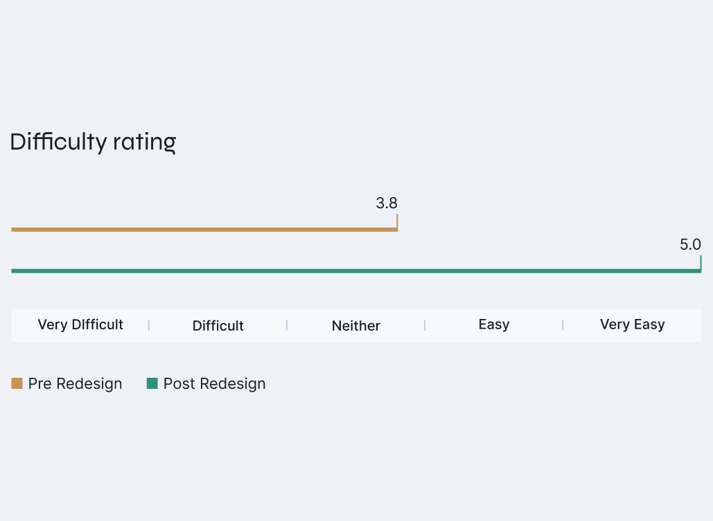
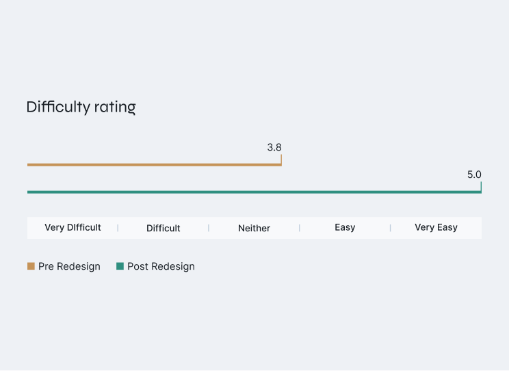
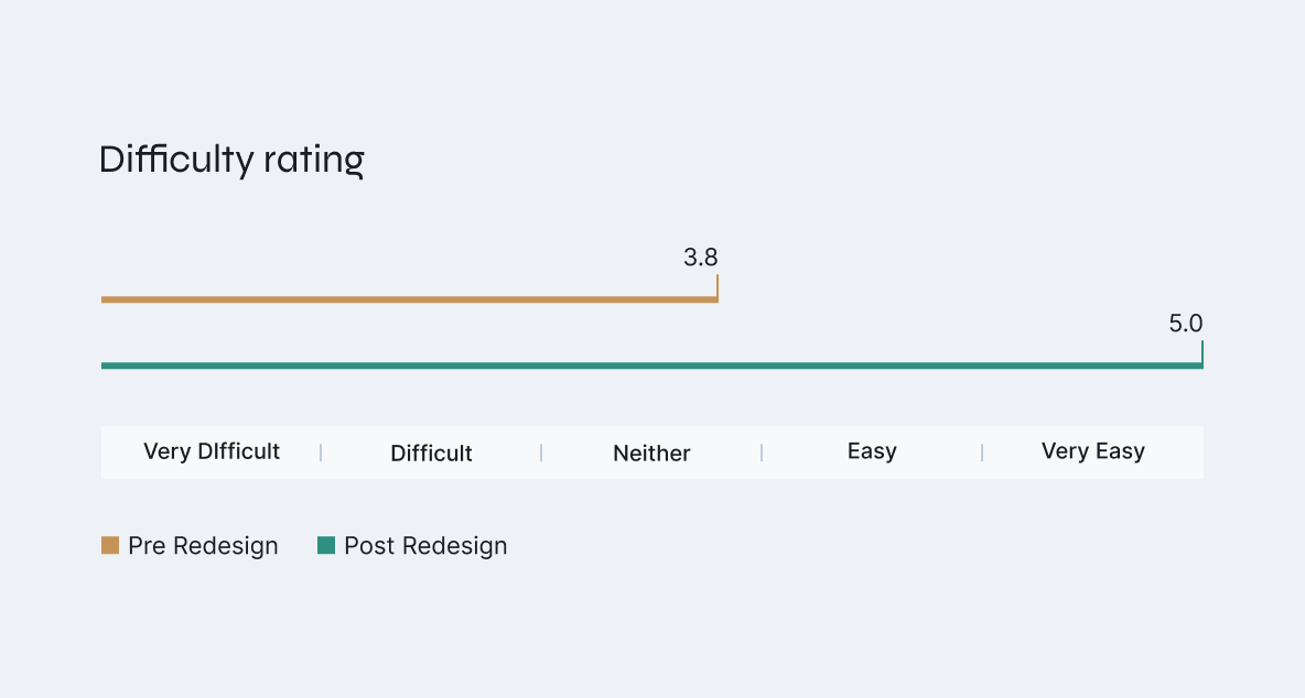
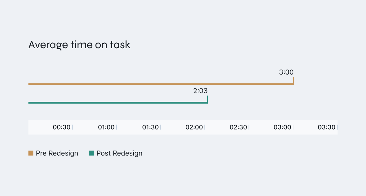
Before the redesign was launched we wanted to validate our decisions. Through another round of usability, we got feedback that the new checkout was a huge improvement. With the shorten steps and entry requirements we brought down the time users spent in checkout which in turn improved difficulty rating to extremely easy. The overall sentiment was very positive. With that validation the business was confident to launch the redesign.
Analytics
After 12 months of monitoring, we observed that the significant drop-off in the funnel had stabilized, with no further dramatic spikes. Conversion rate improved by 3.5%, resulting in an additional $16,000,000.00 in annual revenue. This redesign proved to be a major success for the business and strengthened confidence in the UX process.
CVR
3.5%
Revenue
$16 Million

Designing a faster, more effortless checkout experience
A checkout redesign that improved completion rates and customer sentiment.
2023
Strategy
UX Research
Product Design
CVR
3.5%
Revenue
$16 million
Average time on task
02:03 (1 min less)
Overview
The challenge
Guitar Center is a long-established brand with deep roots in brick-and-mortar retail. But digital growth lagged behind the industry until the pandemic accelerated online sales.
This shift created urgency to modernize the e-commerce experience — starting with checkout, where user friction and drop-offs most directly impacted revenue.
This was the previous version of the checkout.
Problem definition
Analytics showed the biggest drop-off happened between cart and checkout.
Customers often entered checkout just to see the final price — then left when taxes or fees appeared.
From a UX view, the process was long and cluttered. Even when users advanced, excess information slowed them down or caused abandonment.
Enhance Usability
shorten the process and simplify forms.
Increase Conversion Rate
reduce friction and encourage completion.
Optimize for Mobile
ensure a fast, intuitive experience on all devices.
We defined these objectives with our product and business partners.
My role
As Senior UX Designer I led UX strategy and design for Guitar Center’s checkout redesign across web and mobile.
Worked with analytics and product teams to diagnose drop-offs between cart and checkout.
Observed users, benchmarked competitors, and simplified the flow with our updated design system.
Time frame
4 months
Platforms
Web, mobile, native app
Research Methods
Competitive & usability studies, industry benchmarks
Research & Discovery
Industry and competitive analysis
To ground the redesign in best practices, I reviewed checkout usability reports from Nielsen Norman Group and the Baymard Institute to identify current standards around conversion, form entry, and checkout efficiency.
Building on that foundation, I conducted a competitive analysis of leading retailers and Guitar Center’s direct competitors, scoring each experience against a defined set of usability and business criteria. This revealed where Guitar Center lagged, where our competitors excelled, and where opportunities existed to differentiate.
I found that Guitar Center’s biggest competitor fell short in most categories, but there were some valuable examples that helped build internal consensus around our approach.
While our primary competitor underperformed in several areas, those standout examples around transparency and checkout simplification informed the strategic direction of the redesign and strengthened alignment across teams.
Usability study (qualitative)
I began with an exploratory usability study to better understand how customers interacted with Guitar Center’s existing checkout. My goal was to observe pain points, patterns, and overall sentiment before redesign work began.
I conducted moderated sessions with regular Guitar Center customers, focusing on how they navigated each step of checkout, where they hesitated, and what caused confusion. This provided qualitative insight into user behavior.
Key observations revealed friction from redundant steps, unclear progress indicators, and information overload.
Comparative study (quantitative)
To validate findings and establish benchmarks, I conducted a comparative usability study with 40 participants for statistical significance. Participants completed checkout tasks on Guitar Center and Musician’s Friend, our sister brand that had implemented a single-page checkout a few years earlier.
The findings shaped the direction of the redesign, guiding early concepts centered on reducing steps, decluttering screens, and improving flow efficiency.
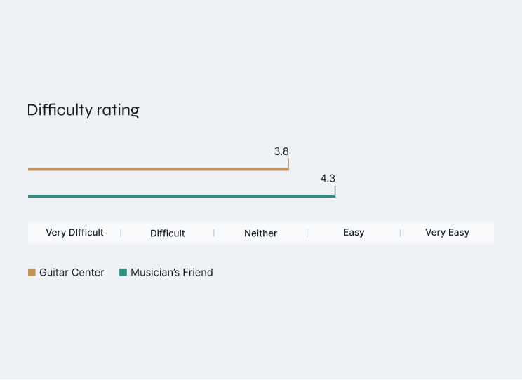
The results showed users completed tasks faster and with less effort on Musician’s Friend’s single-page checkout.
Design Strategy
Product requirements
Before starting design, I met with key stakeholders to clarify business goals and technical constraints. This alignment phase ensured we prioritized the right features early on and avoided costly changes later in the project.
Promote Sign Up
Include an “easy signup” option that uses customer information already gathered.
Improve Store Pickup
Streamline the store finder, simplify contact information entry, and enhance help labels.
Support Split Pay
Allow customers to combine payment methods seamlessly without manual calculations.
More Ways to pay
Integrate Apple Pay, PayPal, and pay-in-4 options such as Klarna and Afterpay.
These were the feature sets identified as critical to improving checkout performance.
Initial Concepts
With industry trends, customer insights, and product requirements in hand, I created a low-fidelity version of the checkout flow. This approach allowed us to present the concepts to developers and stakeholders in a flexible, low-stakes manner, making it easier to accommodate any significant changes if needed. It also provided an opportunity to discuss the specifics of the product requirements in greater detail.
Here are several wireframes that represent the checkout flow and its various components.
We implemented a streamlined sign-up that uses previously entered information, saving users time without disrupting their flow.
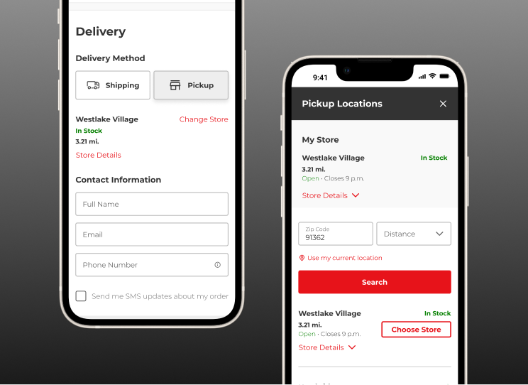
Here’s the refined version of the store picker and customer contact section. I streamlined the selection process and included key store details like driving directions.
The split payment functionality significantly increased the complexity of the design and development effort, but it was crucial for meeting the business's needs.
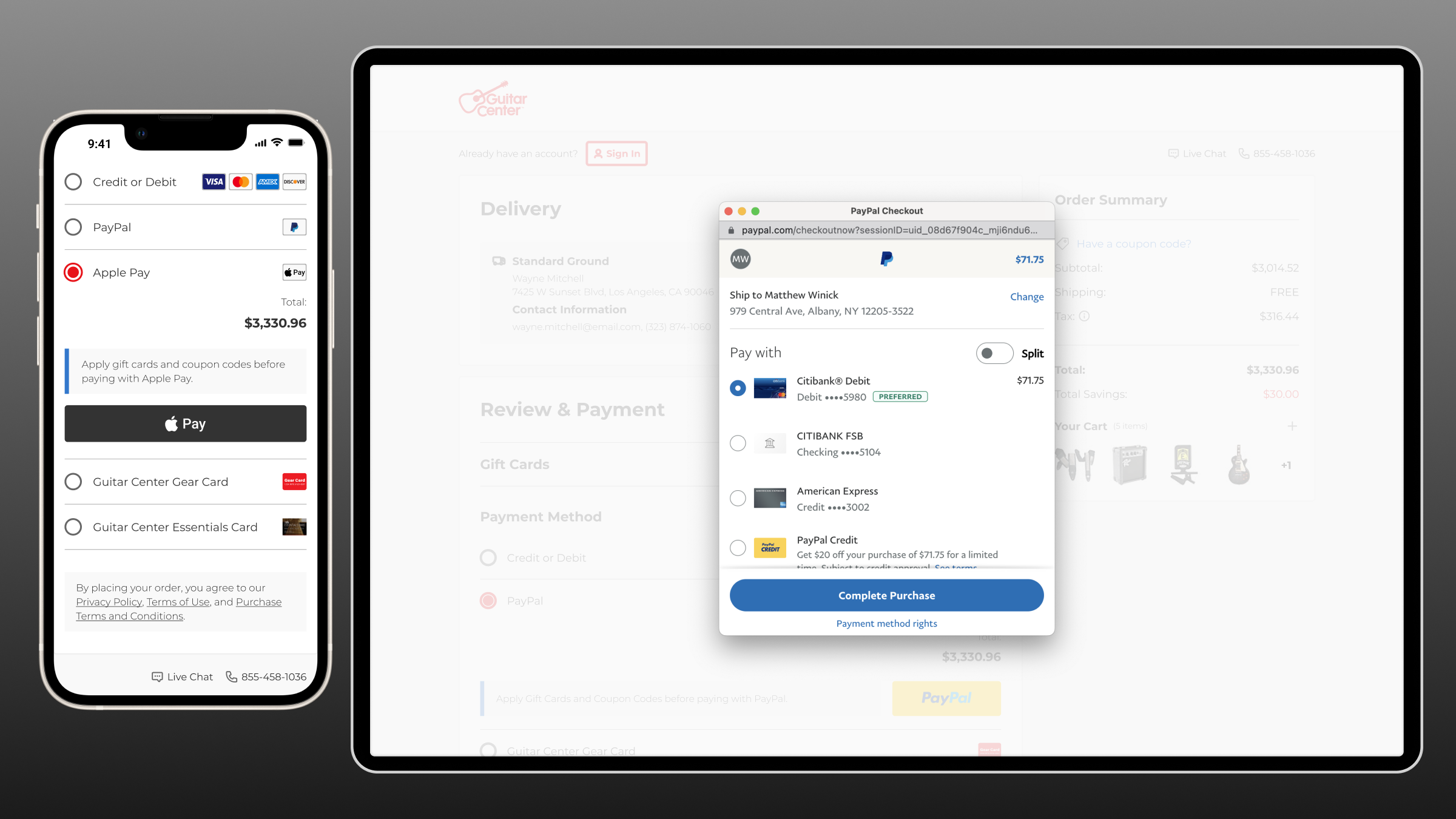
Integrating third-party payment systems required reviewing documentation and ensuring the design aligned with each brand’s specific standards.
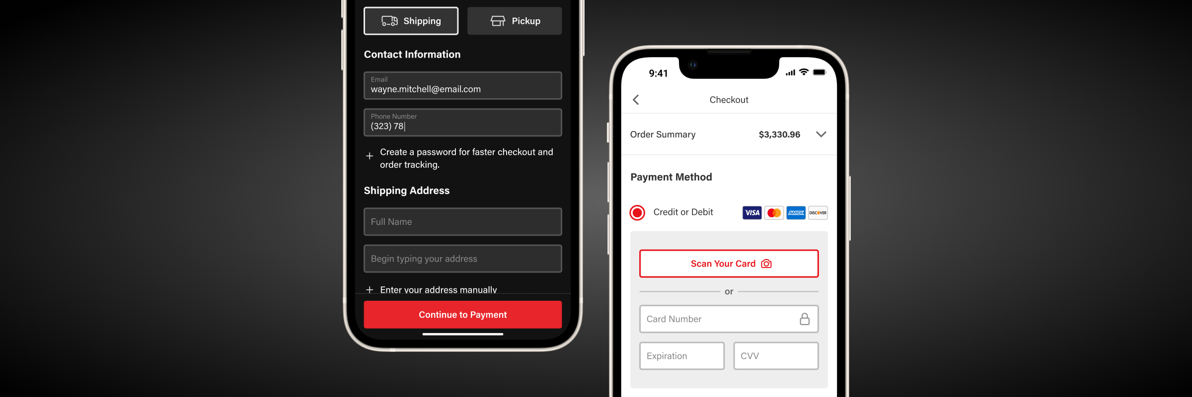
I designed a complete checkout flow for the native app, ensuring full compatibility with light and dark modes.
Outcomes
Validation
Before the redesign was launched we wanted to validate our decisions. Through another round of usability, we got feedback that the new checkout was a huge improvement. With the shorten steps and entry requirements we brought down the time users spent in checkout which in turn improved difficulty rating to extremely easy. The overall sentiment was very positive. With that validation the business was confident to launch the redesign.
Analytics
After 12 months of monitoring, we observed that the significant drop-off in the funnel had stabilized, with no further dramatic spikes. Conversion rate improved by 3.5%, resulting in an additional $16,000,000.00 in annual revenue. This redesign proved to be a major success for the business and strengthened confidence in the UX process.
CVR
3.5%
Revenue
$16 Million
Designing a faster, more effortless checkout experience
A checkout redesign that improved completion rates and customer sentiment.
2023
Strategy
UX Research
Product Design
CVR
3.5%
Revenue
$16 million
Average time on task
02:03 (1 min less)
Overview
The challenge
Guitar Center is a long-established brand with deep roots in brick-and-mortar retail. But digital growth lagged behind the industry until the pandemic accelerated online sales.
This shift created urgency to modernize the e-commerce experience — starting with checkout, where user friction and drop-offs most directly impacted revenue.
This was the previous version of the checkout.
Problem definition
Analytics showed the biggest drop-off happened between cart and checkout.
Customers often entered checkout just to see the final price — then left when taxes or fees appeared.
From a UX view, the process was long and cluttered. Even when users advanced, excess information slowed them down or caused abandonment.
Enhance Usability
shorten the process and simplify forms.
Increase Conversion Rate
reduce friction and encourage completion.
Optimize for Mobile
ensure a fast, intuitive experience on all devices.
Heading
short but descriptive subhead
We defined these objectives with our product and business partners.
My role
As Senior UX Designer I led UX strategy and design for Guitar Center’s checkout redesign across web and mobile.
Worked with analytics and product teams to diagnose drop-offs between cart and checkout.
Observed users, benchmarked competitors, and simplified the flow with our updated design system.
Time frame
4 months
Platforms
Web, mobile, native app
Research Methods
Competitive & usability studies, industry benchmarks
Research & Discovery
Industry and competitive analysis
To ground the redesign in best practices, I reviewed checkout usability reports from Nielsen Norman Group and the Baymard Institute to identify current standards around conversion, form entry, and checkout efficiency.
Building on that foundation, I conducted a competitive analysis of leading retailers and Guitar Center’s direct competitors, scoring each experience against a defined set of usability and business criteria. This revealed where Guitar Center lagged, where our competitors excelled, and where opportunities existed to differentiate.
I found that Guitar Center’s biggest competitor fell short in most categories, but there were some valuable examples that helped build internal consensus around our approach.
While our primary competitor underperformed in several areas, those standout examples around transparency and checkout simplification informed the strategic direction of the redesign and strengthened alignment across teams.
Usability study (qualitative)
I began with an exploratory usability study to better understand how customers interacted with Guitar Center’s existing checkout. My goal was to observe pain points, patterns, and overall sentiment before redesign work began.
I conducted moderated sessions with regular Guitar Center customers, focusing on how they navigated each step of checkout, where they hesitated, and what caused confusion. This provided qualitative insight into user behavior.
Key observations revealed friction from redundant steps, unclear progress indicators, and information overload.
Comparative study (quantitative)
To validate findings and establish benchmarks, I conducted a comparative usability study with 40 participants for statistical significance. Participants completed checkout tasks on Guitar Center and Musician’s Friend, our sister brand that had implemented a single-page checkout a few years earlier.
The findings shaped the direction of the redesign, guiding early concepts centered on reducing steps, decluttering screens, and improving flow efficiency.
The results showed users completed tasks faster and with less effort on Musician’s Friend’s single-page checkout.
Design Strategy
Product requirements
Before starting design, I met with key stakeholders to clarify business goals and technical constraints. This alignment phase ensured we prioritized the right features early on and avoided costly changes later in the project.
Promote Sign Up
Include an “easy signup” option that uses customer information already gathered.
Improve Store Pickup
Streamline the store finder, simplify contact information entry, and enhance help labels.
Support Split Pay
Allow customers to combine payment methods seamlessly without manual calculations.
More Ways to pay
Integrate Apple Pay, PayPal, and pay-in-4 options such as Klarna and Afterpay.
These were the feature sets identified as critical to improving checkout performance.
Initial Concepts
With industry trends, customer insights, and product requirements in hand, I created a low-fidelity version of the checkout flow. This approach allowed us to present the concepts to developers and stakeholders in a flexible, low-stakes manner, making it easier to accommodate any significant changes if needed. It also provided an opportunity to discuss the specifics of the product requirements in greater detail.
Here are several wireframes that represent the checkout flow and its various components.
We implemented a streamlined sign-up that uses previously entered information, saving users time without disrupting their flow.
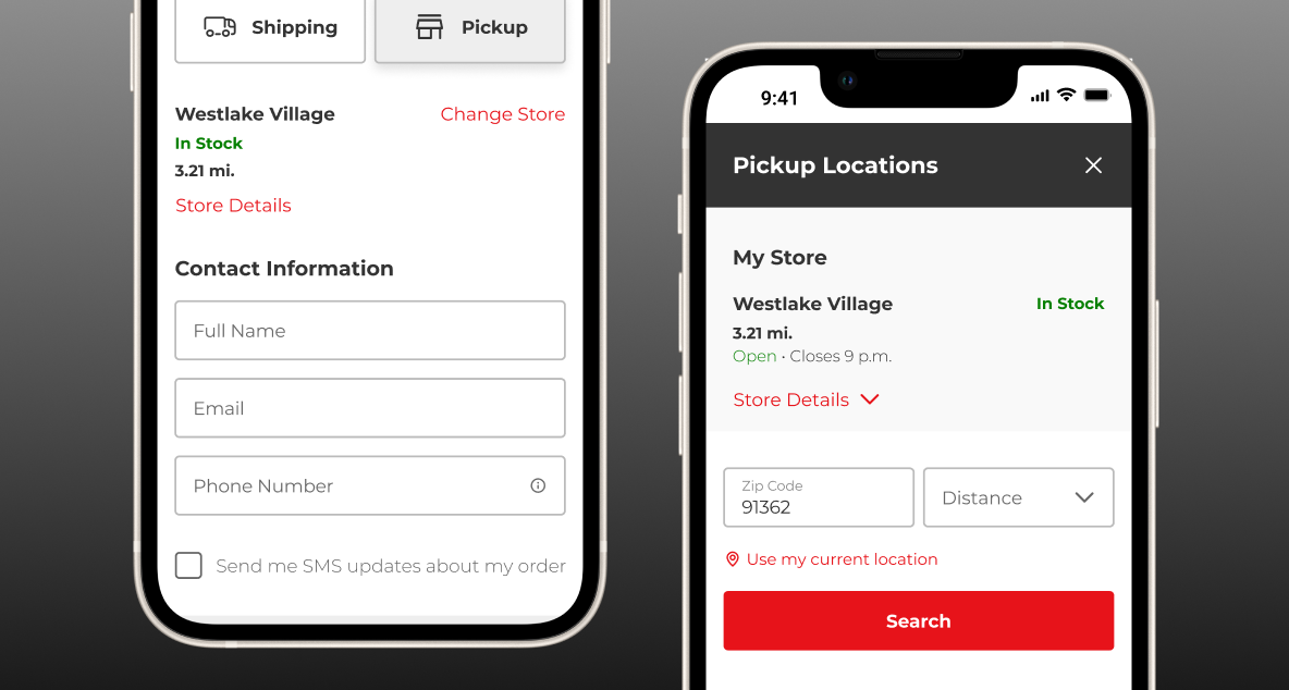
Here’s the refined version of the store picker and customer contact section. I streamlined the selection process and included key store details like driving directions.
The split payment functionality significantly increased the complexity of the design and development effort, but it was crucial for meeting the business's needs.
Integrating third-party payment systems required reviewing documentation and ensuring the design aligned with each brand’s specific standards.
I designed a complete checkout flow for the native app, ensuring full compatibility with light and dark modes.
Outcomes
Validation
Before the redesign was launched we wanted to validate our decisions. Through another round of usability, we got feedback that the new checkout was a huge improvement. With the shorten steps and entry requirements we brought down the time users spent in checkout which in turn improved difficulty rating to extremely easy. The overall sentiment was very positive. With that validation the business was confident to launch the redesign.
Analytics
After 12 months of monitoring, we observed that the significant drop-off in the funnel had stabilized, with no further dramatic spikes. Conversion rate improved by 3.5%, resulting in an additional $16,000,000.00 in annual revenue. This redesign proved to be a major success for the business and strengthened confidence in the UX process.
CVR
3.5%
Revenue
$16 Million