
Visual refresh and experiments for the Loot Crate brand
2018
Visual Design
Product Design

Overview
Project context
Loot Crate was undergoing a full company rebrand, evolving its identity to feel more modern, energetic, and aligned with its diverse fan communities. While the creative team focused heavily on the new brand foundation—illustration style, print collateral, marketing voice, and packaging—there was a pressing need to translate that evolving identity into digital UI patterns and product surfaces.
The existing website relied on outdated type pairings, inconsistent spacing, and a color system that didn’t fully express the brand’s personality or scale across digital surfaces. The rebrand required a fresh UI direction that felt premium, playful, and flexible enough to work across highly variable monthly themes and artwork.
Design Explorations
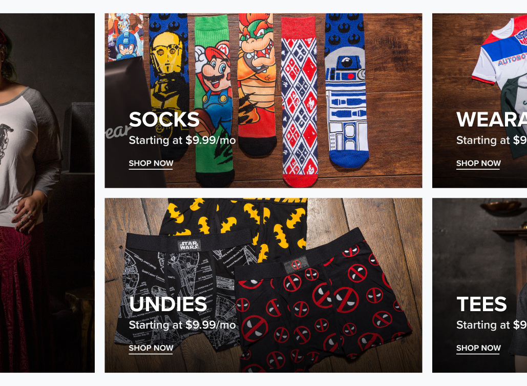
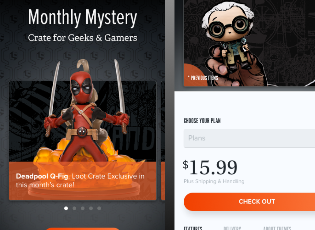
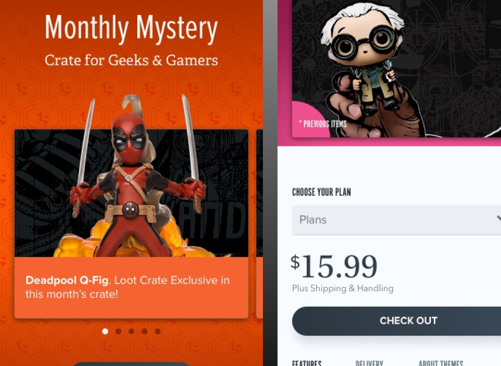
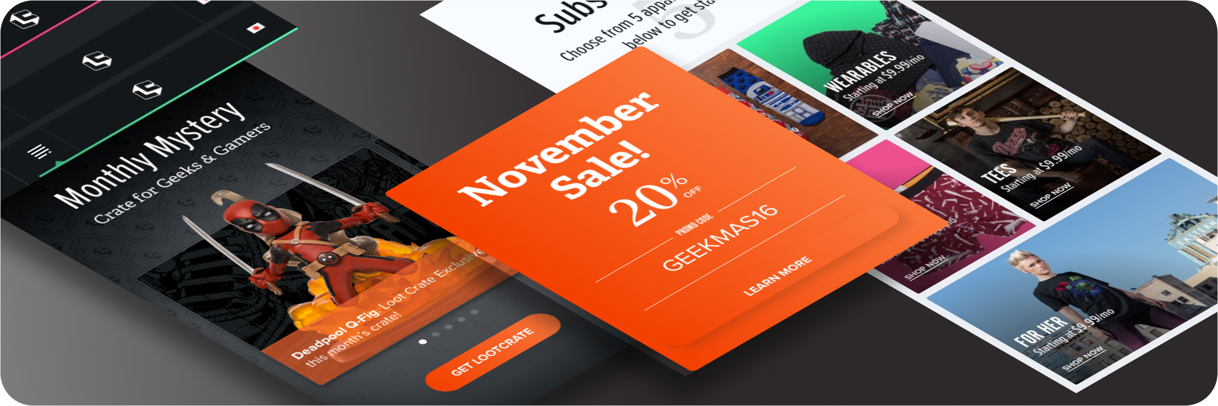
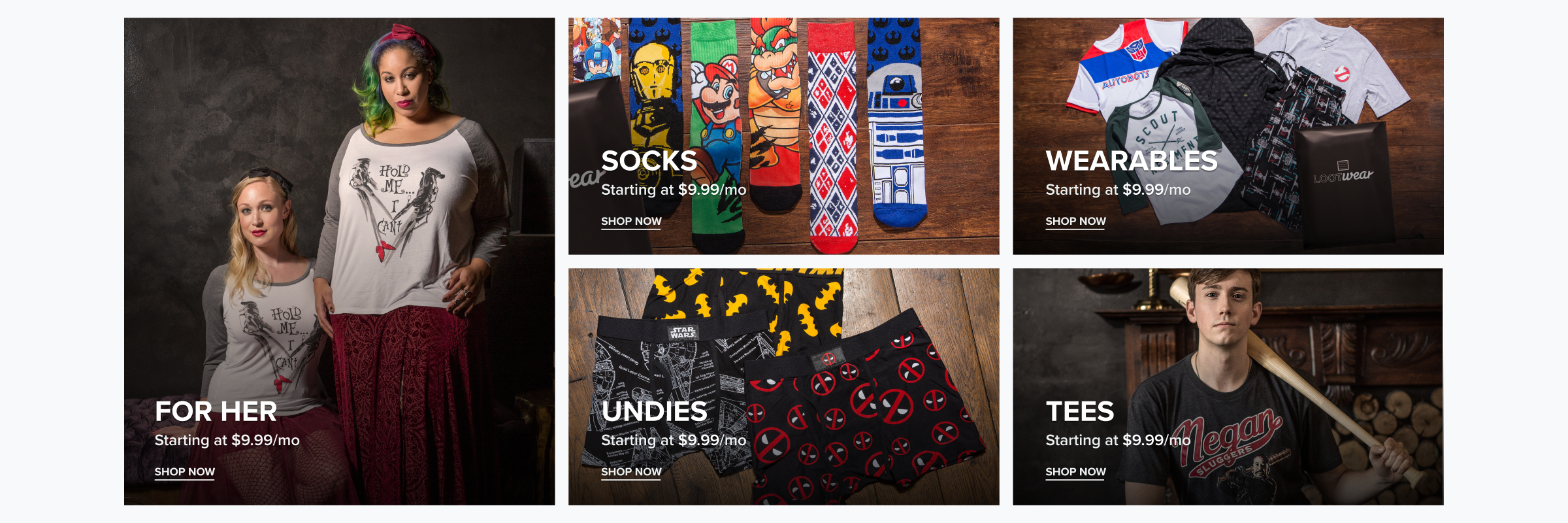
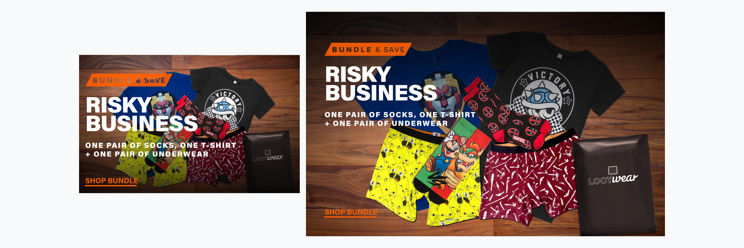
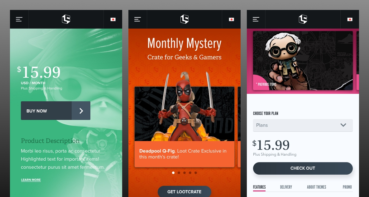
Product cards: explored layouts focused on text overlays, bold type pairings, and balanced visual hierarchy.
Product cards - I incorporated badges and tested color heirarchies.
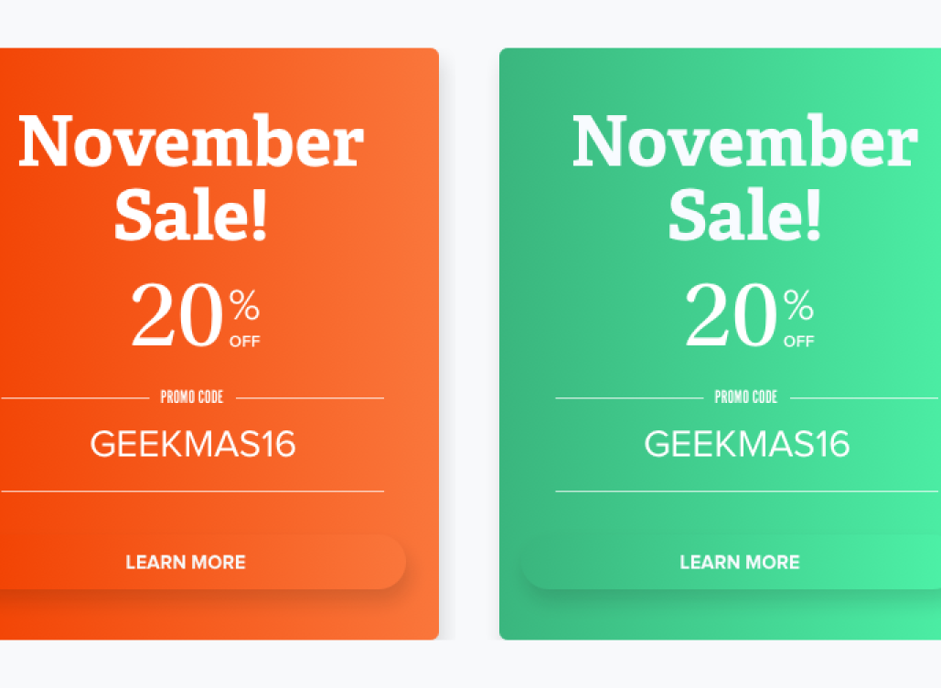
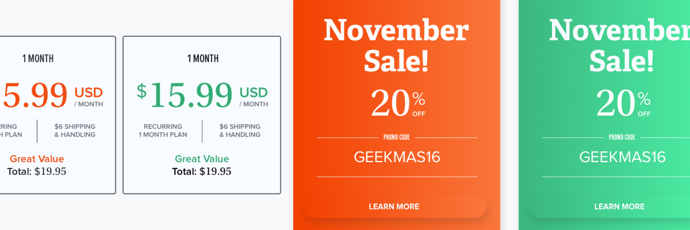
Text lockups: tested font pairings and hierarchy for dense pricing and promotional content.
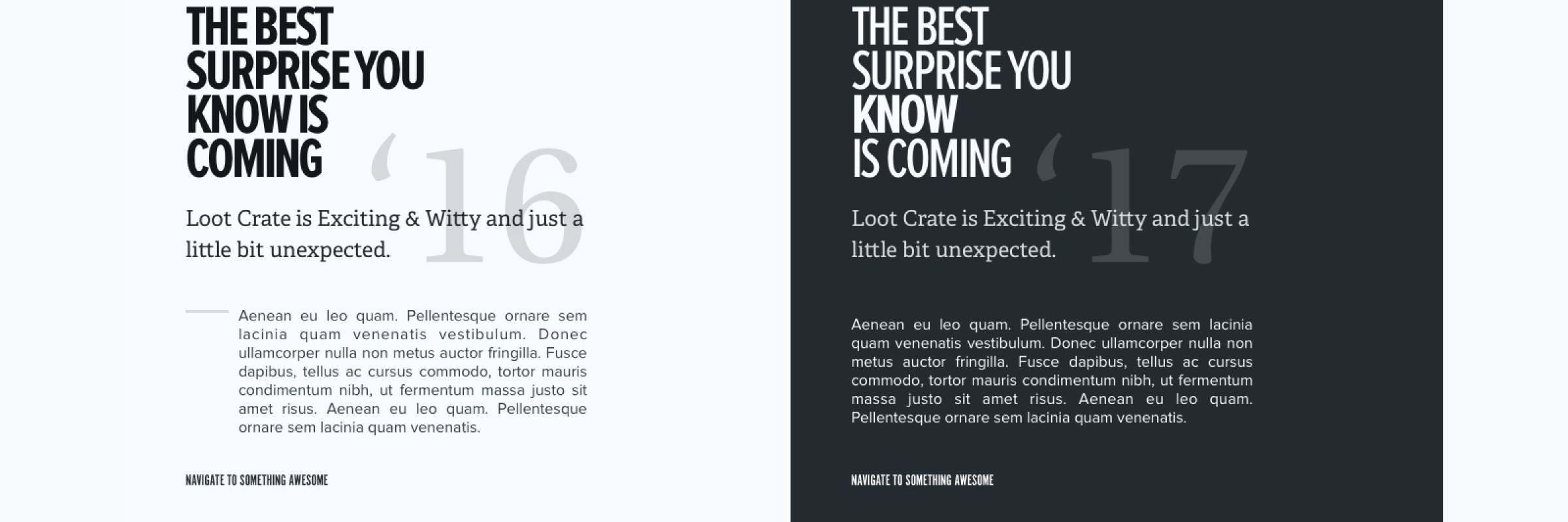
Typography: tested type pairings, weight contrast, and modular type scales.
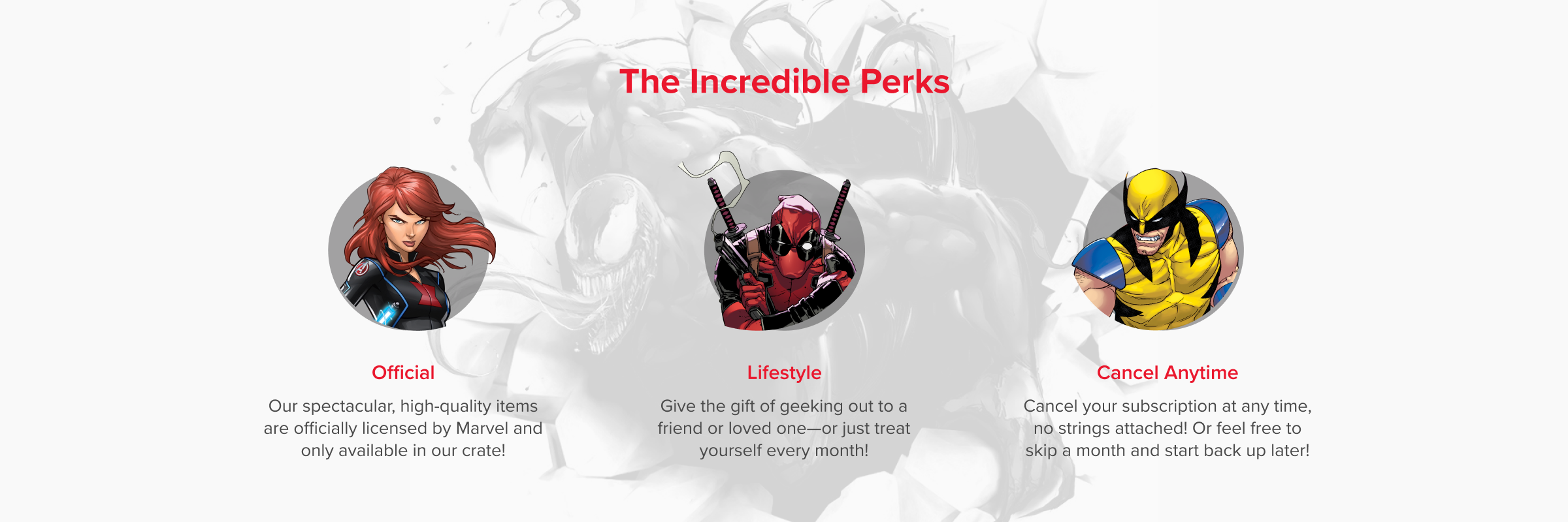
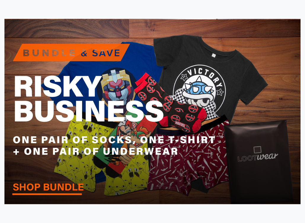
Value propositions: evaluated iconography, hierarchy, and layouts that highlight key benefits and product value.
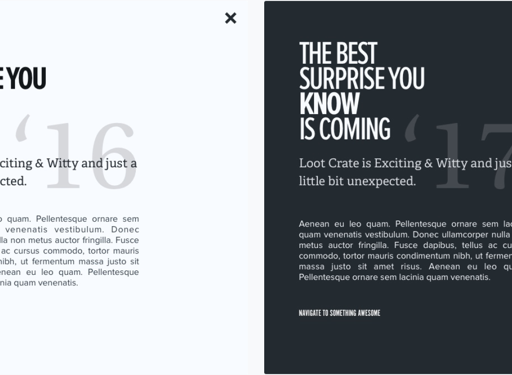
Style Tiles: explored dark UI, color accents, component patterns, and image-as-texture treatments.
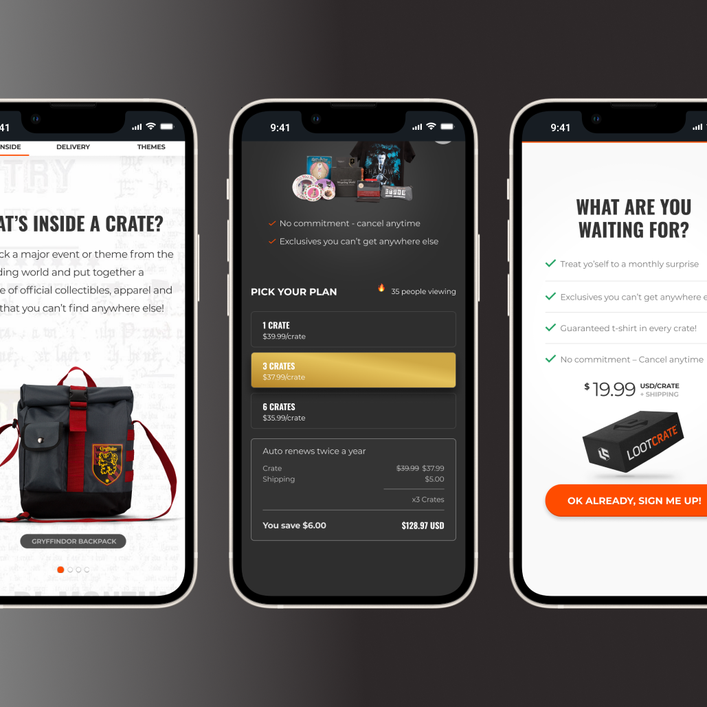
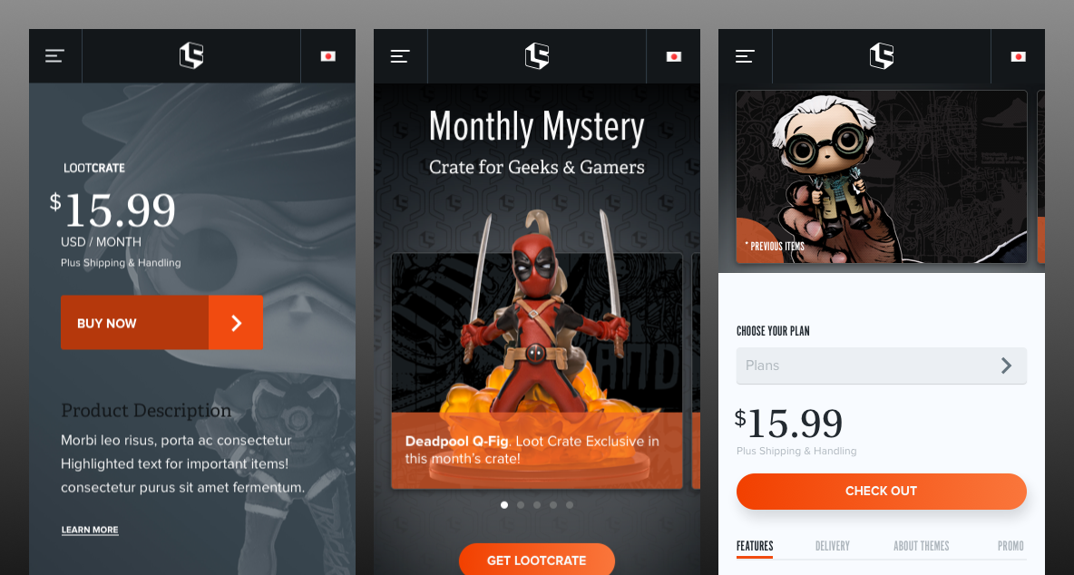
Production pages: brought exploration work into real UI, not every element shipped, but many informed the final experience.
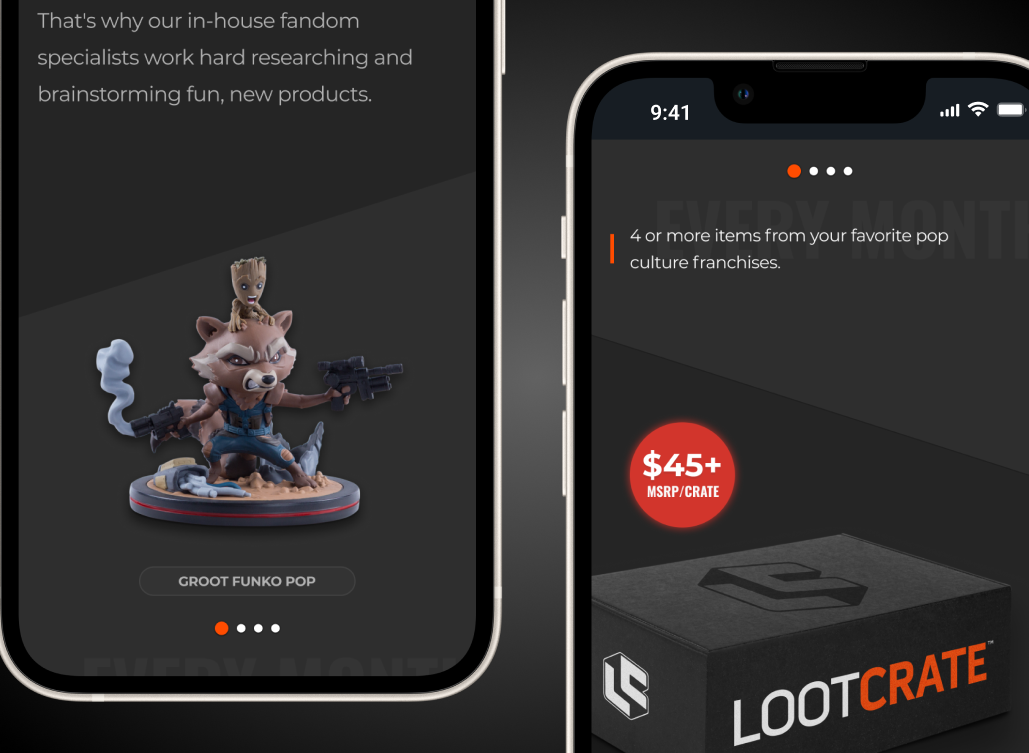
Production pages

Visual refresh and experiments for the Loot Crate brand
2018
Visual Design
Product Design
Overview
Project context
Loot Crate was undergoing a full company rebrand, evolving its identity to feel more modern, energetic, and aligned with its diverse fan communities. While the creative team focused heavily on the new brand foundation—illustration style, print collateral, marketing voice, and packaging—there was a pressing need to translate that evolving identity into digital UI patterns and product surfaces.
The existing website relied on outdated type pairings, inconsistent spacing, and a color system that didn’t fully express the brand’s personality or scale across digital surfaces. The rebrand required a fresh UI direction that felt premium, playful, and flexible enough to work across highly variable monthly themes and artwork.
Design Explorations
Product cards: explored layouts focused on text overlays, bold type pairings, and balanced visual hierarchy.
Product cards - I incorporated badges and tested color heirarchies.
Text lockups: tested font pairings and hierarchy for dense pricing and promotional content.
Typography: tested type pairings, weight contrast, and modular type scales.
Value propositions: evaluated iconography, hierarchy, and layouts that highlight key benefits and product value.
Style Tiles: explored dark UI, color accents, component patterns, and image-as-texture treatments.
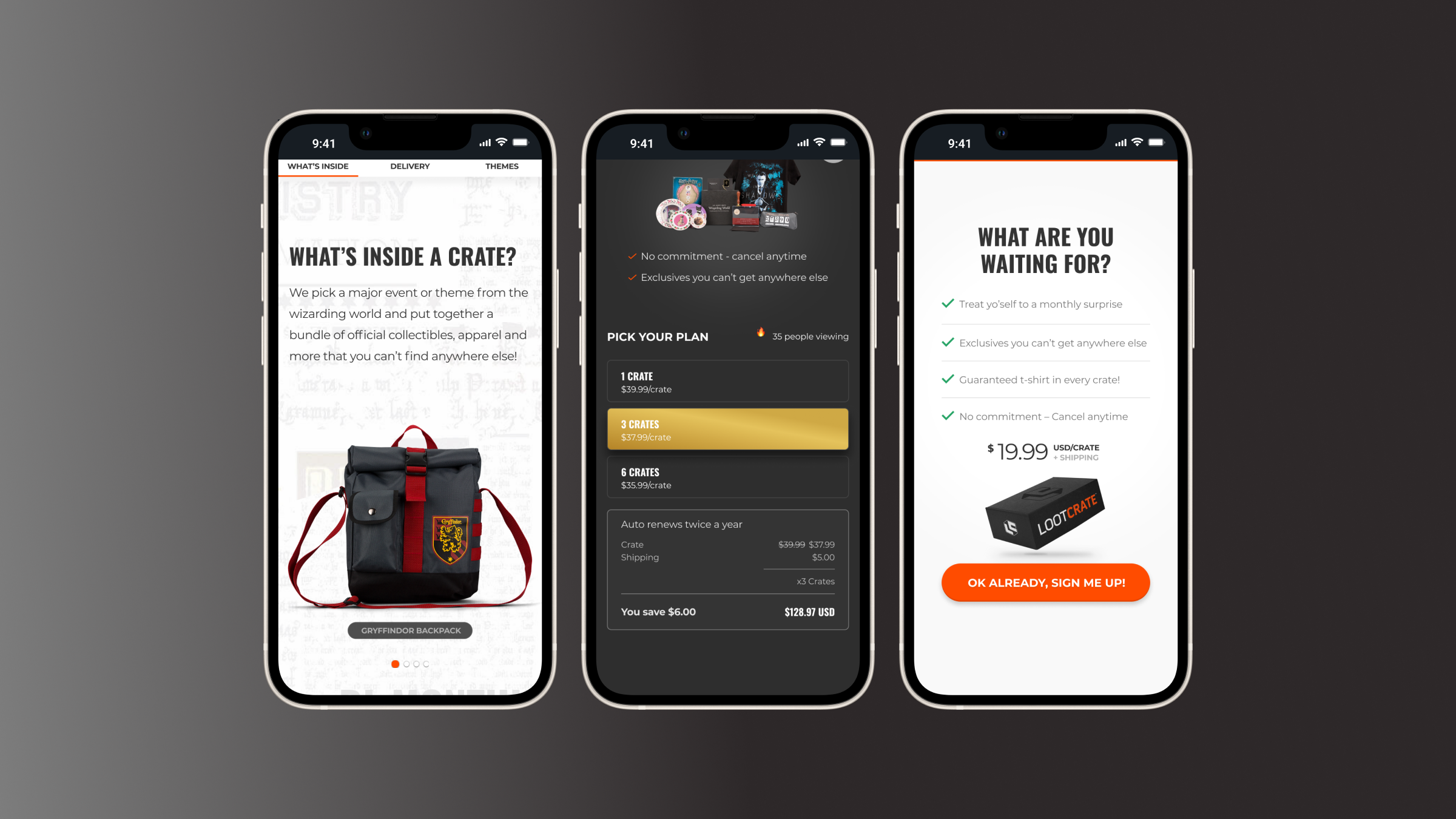
Production pages: brought exploration work into real UI, not every element shipped, but many informed the final experience.
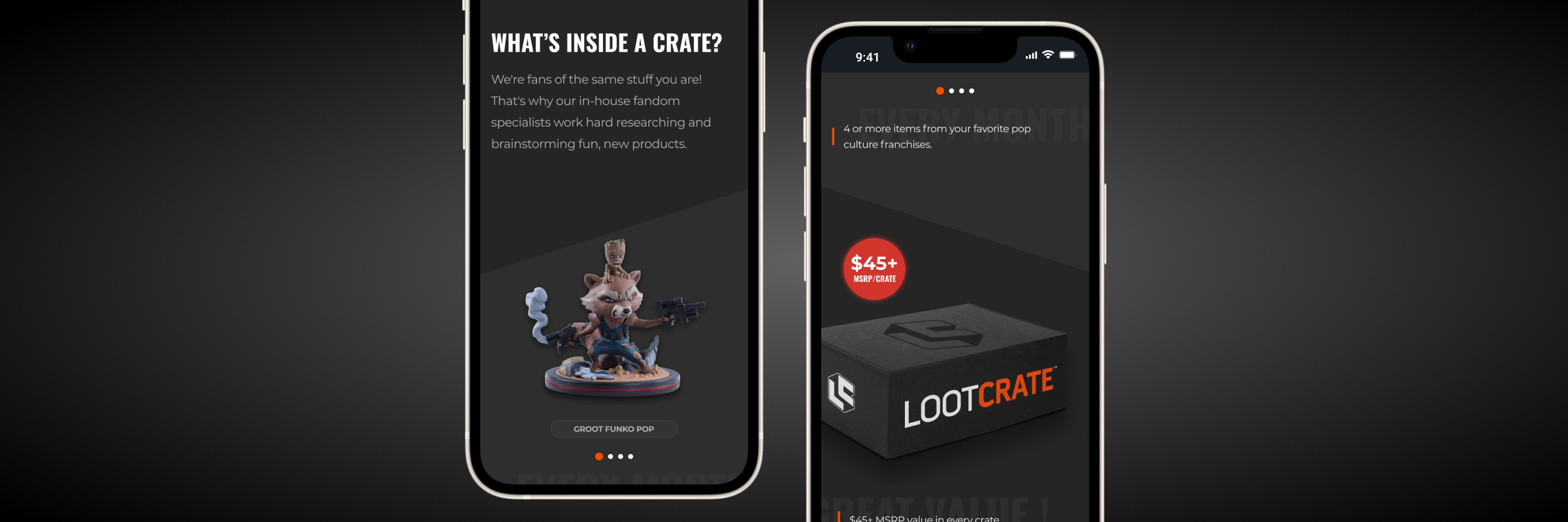
Production pages
Visual refresh and experiments for the Loot Crate brand
2018
Visual Design
Product Design
Overview
Project context
Loot Crate was undergoing a full company rebrand, evolving its identity to feel more modern, energetic, and aligned with its diverse fan communities. While the creative team focused heavily on the new brand foundation—illustration style, print collateral, marketing voice, and packaging—there was a pressing need to translate that evolving identity into digital UI patterns and product surfaces.
The existing website relied on outdated type pairings, inconsistent spacing, and a color system that didn’t fully express the brand’s personality or scale across digital surfaces. The rebrand required a fresh UI direction that felt premium, playful, and flexible enough to work across highly variable monthly themes and artwork.
Design Explorations
Product cards: explored layouts focused on text overlays, bold type pairings, and balanced visual hierarchy.
Product cards: incorporated badges and refined color hierarchy to strengthen visual priority.
Text lockups: tested font pairings and hierarchy for dense pricing and promotional content.
Typography: tested type pairings, weight contrast, and modular type scales.
Value propositions: evaluated iconography, hierarchy, and layouts that highlight key benefits and product value.
Style Tiles: explored dark UI, color accents, component patterns, and image-as-texture treatments.
Production pages: brought exploration work into real UI, not every element shipped, but many informed the final experience.
Production pages